A friend sent me this table, and it tells the story about Medicare.
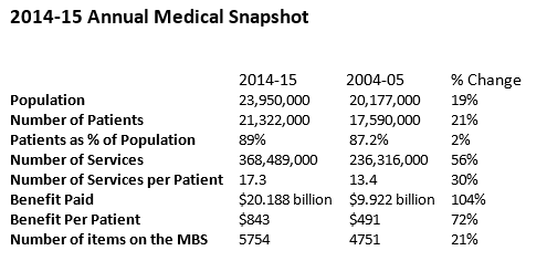 Number of patients stable with population, but on average receiving 30% more services, but the benefit per patient has increased 72%. Over the same period inflation increased 30%, National GDP increased 36% and GDP per capita only 13.5%.
In other words, Medicare has been sneaking more and more of the available pie over the last 10 year period and is getting fat, resulting in an increase in benefit per patient well in excess of the rate of inflation, and the rate of growth in the economy.
We might be a richer economy, but Medicare is running even faster ahead.
On a side note, the GDP per capita figure is a shocker. Australia has a productivity problem, and it is apparent from this that real growth is an illusion of population growth, but that raises the question whether population growth, which is driven by high levels of immigration, might also be blunting productivity growth. Room for some additional research.
However, when you look at GDP per capita figures, you know why voters are a little skittish. On a personal level things haven’t been getting better for a while.
So it makes sense to look at what Medicare is funding. Perhaps some of those procedures are unnecessary. It would also make sense to look at what it is paying in benefits to medical practitioners. It’s possible that part of the increase in the cost of Medicare is that the GDP per capita for doctors has been outpacing GDP per capita for everyone else too.
Again, room for some additional research.