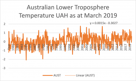
We’ve been slow posting this month. The UAH temperature anomaly for March was 0.59 degrees. This is identical to last year.
The satellite record shows temperature to have been in a mild uptrend since 1978 when the record began. March continues the down trend since the last major El Nino event in 2016, with this year’s March being only the ninth hottest, tying with last year’s March.
Roy Spencer has published an interesting post comparing the satellite readings for Australia with the land-based record. It appears that the two are not directly comparable on a month by month basis, but align, with some variance, over the longer term.
Some of the variance is explained by weather we are experiencing drought conditions. These are related to El Ninos, and the lack of surface moisture leads to a higher land temperature, which is obviously independent of any CO2 emissions. Which is another reason to prefer the satellite measurements when trying to understand climate.
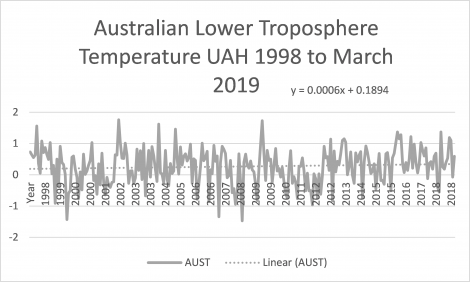
 The graph below shows temperature since 1998, the time of the global hiatus in temperature increase. It shows up in Australia with the rate of temperature increase in the last 20 or so years being half what it has been over the whole temperature set.
What it shows is an average 0.144 degree increase in that time. Not zero, but also not something you would notice. Something to keep in mind with the relentless media barrage of “new record high temperatures”.

If you want to play around with the data yourself then you can download it from Roy Spencer’s site.