


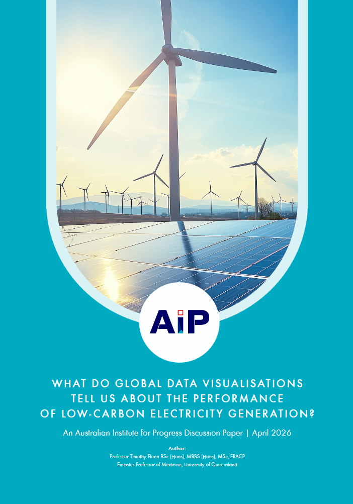
 This paper by Professor Tim Florin uses data visualisations from Our World in Data and other sites to walk you through the current state of renewable energy compared to the alternatives.
To read the paper download it here.
It is stunning how little difference to the consumption of fossil fuels the world has made over the last 20 or so years since Australia signed-on to reducing emissions, and impossible to believe that on the current trajectory any of the Kyoto or subsequent targets will be met by most countries.
Read this paper to find out which countries have actually come closest to a decarbonised electricity grid and where Australia ranks. Understand why renewables are additive rather than substitutive (they supplement fossil-fuel generation rather than replacing it).
When the issues are laid out, the solutions become clear, which raises the question – how did we convince ourselves to keep doing what we are doing, doubling down when things weren’t working?
The more people ask that question, the sooner we will implement real solutions. Don’t keep this analysis to yourself, send a link to the paper to everyone you know.